Background
The Risk Management Agency (RMA) redesign was part of a broader USDA initiative to modernize and consolidate agency websites on Drupal.
RMA administers the federal crop insurance program, partnering with private insurance companies to provide risk management tools that protect American farmers and ranchers against crop loss and revenue volatility.
The project focused on migrating thousands of insurance policy documents and guidance materials, modernizing the platform, restructuring the information architecture, and improving search and discoverability for the agency’s primary users.
My Role
I served as DesignOps and UX Lead for the RMA redesign as part of the larger FPAC Web Modernization program. I directly managed a cross-functional design team of content strategists, UX architects, and visual designers, guiding the work from discovery through final design approval.
Challenge
The RMA website functioned as a decades-deep archive of federally mandated crop insurance policy documents. Thousands of highly technical PDFs needed to be rehoused while becoming easier to navigate and retrieve.
How could we modernize a dense, highly regulated document ecosystem while improving user experience and trust?
Solution
Using Human-Centered Design best practices, I created an experience strategy that ensured our team followed a research-based approach to this redesign that fit into our compressed time frame.
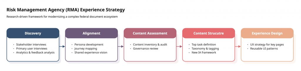
Discovery
Our goals entering discovery were to learn about the primary audience and their needs, uncover stakeholder priorities, and document any constraints.
Our methods included stakeholder interviews, user interviews, and analysis of existing Google Analytics data and open feedback captured via the website.
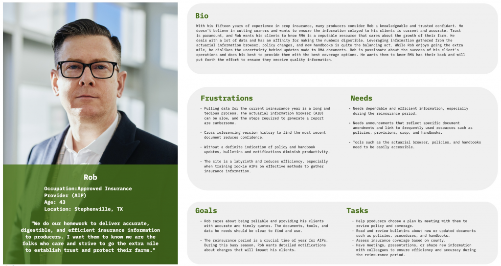
Through this research we learned the target audience for this website are a group called Approved Insurance Providers (AIPs). These insurance providers sell RMA-backed insurance products to American farmers and rely on the website to locate policy documents and guidance for their clients.
Despite frequent use and familiarity with the website, AIPs struggled to find what they were looking for. On average they were spending 10 minutes per visit to locate a single document, and they were candid in expressing their frustration during our conversations.
“Anybody in crop insurance should be able to get close to what they are looking for most of the time. Sometimes might be hard to know if you picked the right one.”
– Approved Insurance Provider
Alignment
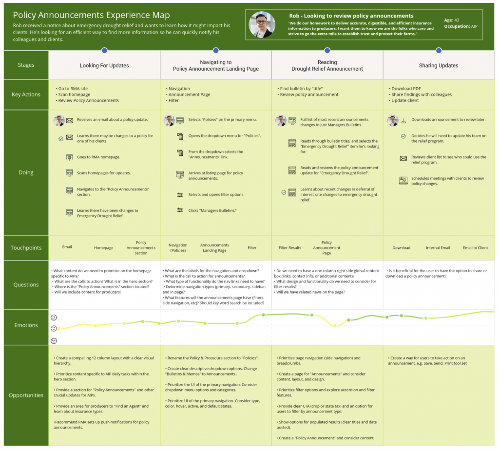
To establish a shared understanding of our primary audience and resolve internal disagreement about who the site was built to serve, we created an Approved Insurance Provider persona named Rob. Rob gave the team, and our stakeholders, a clear reference point for evaluating design decisions against real user goals.
Next, we followed Rob through one of his top tasks: learning about a policy change that could impact his clients. Mapping the stages, actions, touchpoints, and emotions revealed where friction occurred and which pages required focused UX attention.
Content Assessment
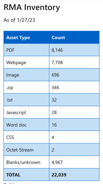
We conducted a content inventory and audit to understand the scale and structure of the existing ecosystem. With thousands of documents spanning decades, reviewing every asset was not feasible. We prioritized analysis based on IA depth and page traffic to focus on the highest-impact areas.
We mapped existing metadata fields, performed a ROT analysis, and evaluated how documents were uploaded and maintained. Most files were manually uploaded PDFs with little to no structured metadata. Governance varied by department, and content types and SEO fields did not exist in the legacy CMS.
This assessment exposed structural gaps that needed to be addressed before redefining the architecture.
Content Structure
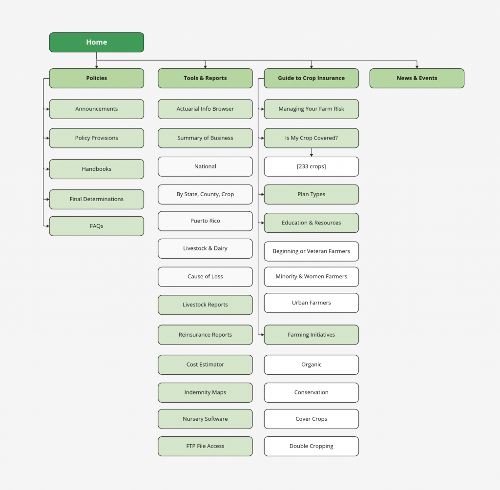
Guided by our north star of improving document retrieval and user confidence, we redesigned the information architecture to focus on what users actually need: policies and tools.
The new IA grouped content by audience to increase relevance, used clearer and more general terminology to serve all user types, and consolidated redundant pages. We also eliminated infrequently used and outdated content while introducing new pages that supported RMA priorities, such as connecting new and minority farmers with educational resources.
In parallel, we conducted a detailed content mapping exercise to translate legacy material into structured Drupal content types. We defined standardized metadata fields, introduced SEO attributes that did not exist in the previous CMS, and documented missing metadata for manually uploaded documents to support long-term governance.
Experience Design
With a clear north star of reducing effort and increasing confidence in document retrieval, we designed search-driven workflows that made critical policy information easier to locate and verify. We surfaced key data points such as crop year, commodity, and document type directly within policy libraries to minimize guesswork and unnecessary navigation.
Using USWDS as our baseline design system, we implemented modern filtering patterns that allowed users to quickly narrow results and confirm they had the correct and most current document. Each interaction was evaluated against Rob’s workflow to ensure we were reducing search loops rather than adding new friction.
An example: Crop Policy Handbooks
Handbooks page, old website
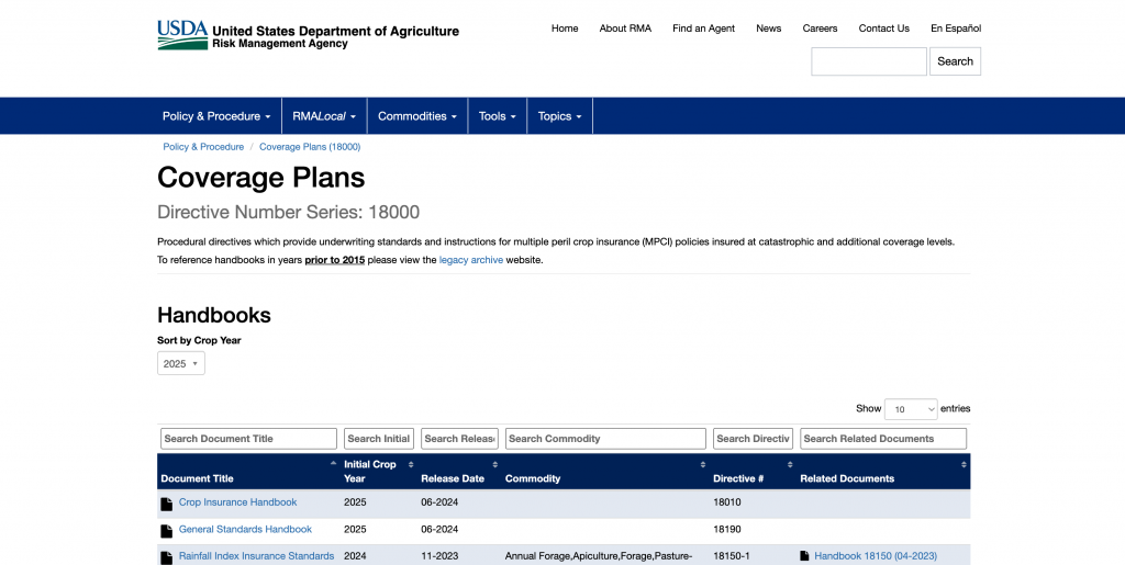
Tables defaulted to alphabetical sorting when AIPs are looking for the most recent documents
All filters require users to type exact language to get results
Negative space at the top of the page causes unnecessary scrolling
Handbooks page, new design
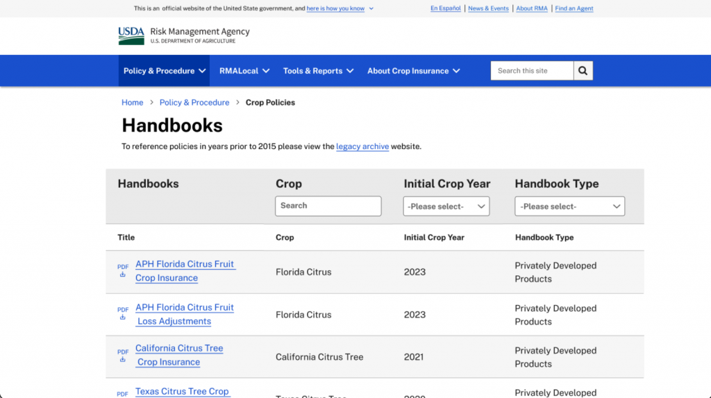
Tables display newest documents first
Filters are a mix of open search and pre-populated dropdowns, reducing cognitive burden when searching.
Negative space and unnecessary jargon is removed, putting important information at the top of the page
A Curveball, Weeks Before Launch
In the final weeks before launch, RMA leadership chose to revert to the legacy filtering model rather than implement the research-backed enhancements that had been previously approved. We shared the supporting research and outlined the expected user impact, but ultimately aligned with stakeholder direction.
While some of our recommendations were accepted, like the new IA, some plain language improvements, and the new UI, RMA’s decision to retain the legacy filtering model limited our ability to measure meaningful improvements in document retrieval and user confidence.
Outcomes
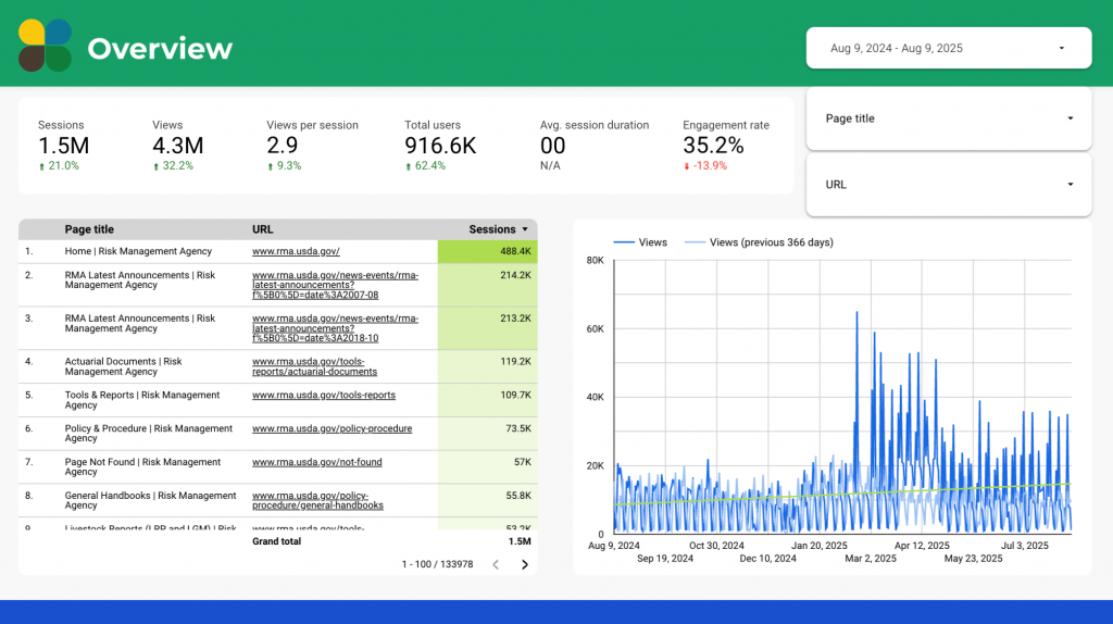
Although several research-informed enhancements were ultimately not implemented, the redesign delivered measurable gains. One year post launch, sessions increased 21 percent and total users increased 62 percent.
Organic search visibility improved substantially due to the introduction of structured metadata, defined content types, and crawlable SEO attributes that did not exist in the legacy system. The improved content structure increased discoverability across policy libraries and tools, resulting in significant growth in organic referrals.