Unifying Four Agencies Under One Digital Ecosystem
-
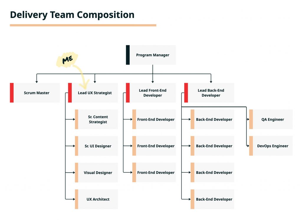
My Role: DesignOps and UX Lead
-
Project Duration: 2 years (+9 month contract extension)
-
Scope: Four agency websites – FSA, RMA, NRCS, and FPAC BC
Background
The Farm Production and Conservation (FPAC) Web Modernization Program set out to redefine how USDA’s farmer-facing agencies serve the public. The goal was to bring four separate agency sites onto modern Drupal platforms and create one consistent experience for the people who rely on them most — farmers, producers, and staff.
Three agencies (FSA, RMA, FPAC-BC) underwent full redesigns and migrations, while NRCS received operations, maintenance, and targeted UX and content improvements. Together, these efforts built a unified foundation that helps FPAC communicate with one voice.
My Role
As the UX lead for the program, I served as both the strategic and operational anchor for the team. I was the primary UX voice for stakeholders and guided the direction of research, content strategy, and design across all FPAC websites. I built the DesignOps foundation that enabled the team to work consistently and stay on schedule, while coaching and supporting the designers day to day.
Challenge
Before modernization, each agency operated independently, managing its own website, publishing tools, and design. For farmers, this meant confusion and repetition — the same programs explained differently across multiple sites. For editors, it meant duplicating content with no shared structure or workflow.
Outdated systems and inconsistent tone made the experience feel fractured. Many farmers didn’t realize they were still within USDA when navigating between agencies.
“The website is difficult to use. There’s too much jargon and not enough plain language for new farmers.”
— Sustainable farmer, Wisconsin (FSA Website Interview, 2023)
We needed to rebuild trust in FPAC’s digital presence by unifying four agencies into one coherent ecosystem — clear, consistent, and grounded in user needs.
Approach
We followed a human-centered, content-first approach, focusing on what farmers and staff needed most, then balancing those insights with stakeholder goals to design something scalable and sustainable.
Defining a Shared Vision
We kicked off with a visioning workshop I created and facilitated for FPAC leadership. It was the first time all four agencies collaborated to define what a unified online experience should look like. Conducted virtually in Miro, the session helped leadership align on problems, priorities, and what success should mean for both farmers and staff.
Key Takeaways
- Disconnected systems and content: Historical workflows created duplication and unclear ownership.
- Pride in serving farmers: Every stakeholder shared a strong mission to make information easier to find.
- Common goal: One unified digital experience for farmers, supported by simpler workflows for staff.
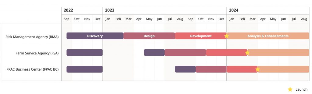
Creating Our 2 Year Roadmap
Once the vision was set, we turned it into a clear plan. Working with the program manager and technical leads, I helped shape a roadmap that defined priorities, dependencies, and time for research, design, and iteration.
We migrated and redesigned the sites sequentially to build efficiency as we went. The Risk Management Agency (RMA) launched first, followed by the Farm Service Agency (FSA), then FPAC Business Center (FPAC-BC).
Solution
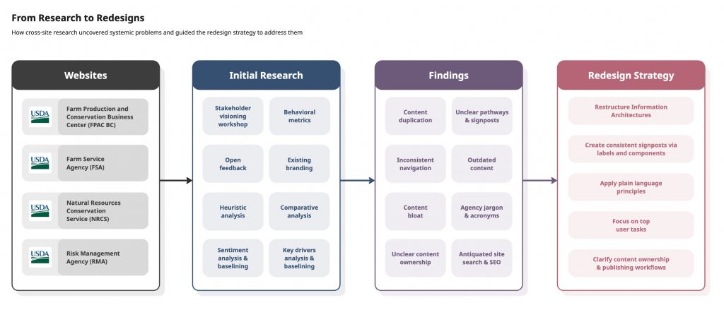
Discovery at Scale
Before touching a single design, we needed a full picture of FPAC’s web ecosystem. We combined analytics, surveys, user feedback, and comparative analysis to identify shared issues across all agency sites.
Across the board, one theme dominated: “I can’t find what I’m looking for.”
That frustration came from outdated or duplicated content, inconsistent navigation, and agency-specific jargon. These findings shaped our redesign priorities around findability, clarity, and trust.
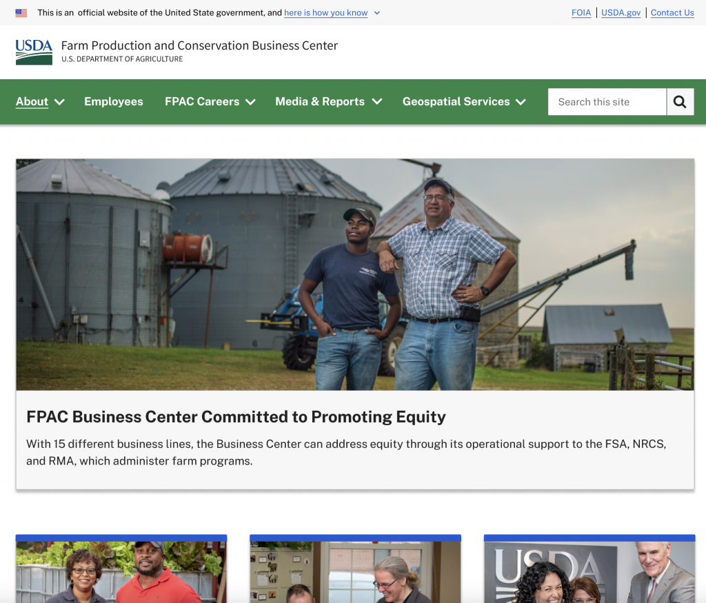
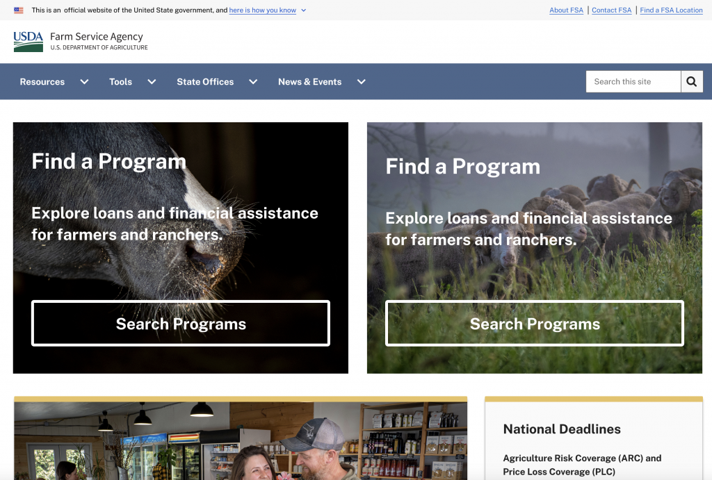
The original agency homepages shown below illustrate this fragmentation — each site had its own structure, design, and tone, making it difficult for farmers to recognize they were still within USDA or to find consistent information across agencies.
FPAC BC Home Page

FSA Home Page

NRCS Home Page

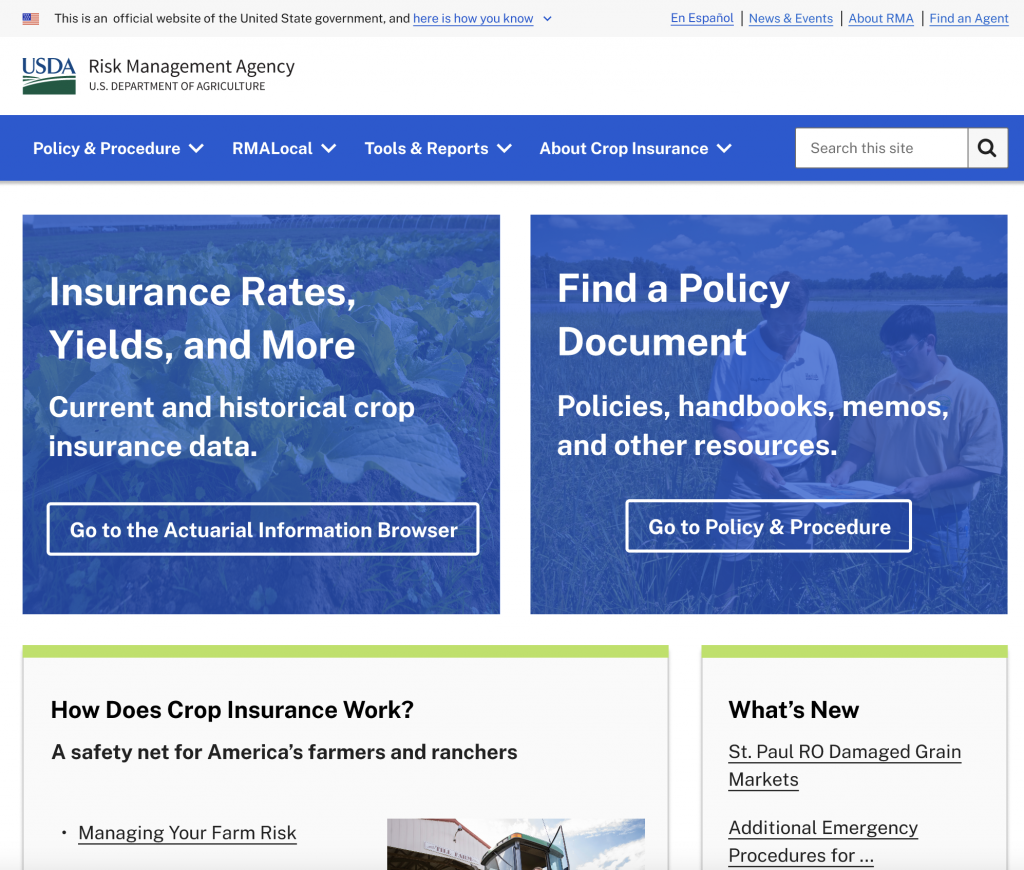
RMA Home Page

Applying Our Redesign Strategy
Each agency followed the same framework — stakeholder interviews, user interviews, content audits, and information architecture planning before design began.
Stakeholder and User Interviews
We spoke with subject-matter experts from each agency to understand their goals, audiences, and internal pain points. Then we turned to end users:
- RMA: Approved insurance providers who sell crop insurance.
- FSA: Farmers and producers — from new to multi-generation operations.
Across all audiences, the same issues surfaced: unclear ownership, inconsistent content, and difficulty finding reliable information.
Information Architecture and Content Strategy
Each site had tens of thousands of pages. Once we understood user needs, we:
Created full content inventories and audited high-traffic pages.
- Identified redundancies and content needing SME review.
- Drafted new IA models based on how farmers search, not how agencies are structured.
For FSA, we conducted two rounds of tree testing to validate the structure and labels. We also aligned navigation terms with search data from Google Search Console and site search logs to match real user language.
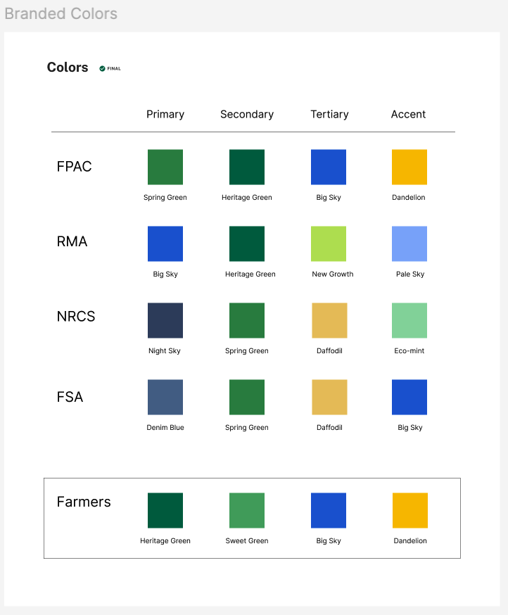
Creating a Shared Design Language
With research and IA complete, we designed a scalable system that worked across all FPAC sites.
We started with the U.S. Web Design System (USWDS) and adapted it for FPAC, reusing proven components from Farmers.gov and extending them for agency-specific needs.
To balance consistency and identity:
- Shared elements: Layout, navigation, typography, and key components.
- Flexible elements: Color palettes and imagery to reflect each agency’s focus.
This gave users a familiar experience across sites while preserving each agency’s individuality.

Outcomes
Solving Users’ Top Pain Point
Before the redesign, farmers struggled to locate basic program information. Through improved IA, search visibility, and plain language, that problem was measurably solved.
- RMA impressions increased by 1,336% and clicks rose by 755%, showing major gains in both visibility and engagement.
- FSA impressions grew by 322% and clicks by 248%, proving that farmers can now find and access relevant content faster.
- Top program pages collectively received over 1 million sessions, accounting for one-third of all FSA traffic.

Search That Matches Farmer Language
We validated our navigation and labels against real user data from site search and Google Search Console, ensuring farmers could use their own words to find what they need.
- Top searches now align directly to program results (e.g., “grants,” “cattle,” “SDRP”).
- High-interest programs like Farm Ownership Loans and Supplemental Disaster Assistance now lead search results, earning 15K+ and 9K+ clicks respectively.

Simpler, More Consistent Experience Across Devices
A unified design system and modern Drupal backend improved accessibility and mobile usability.
- 61% of users now access FPAC sites on desktop and 38% on mobile, with consistent experiences across both.
- Shared templates and components reduced time to publish and maintain content across four agencies.
FPAC BC Home Page
FSA Home Page
RMA Home Page